My Role
Research, UX, UI
Project Type
A wedding planning tool for Queer couples
Creating a space for Vivid Unions
Intro
The legalization of gay marriage in the US has led to celebration and greater queer inclusion in the wedding industry since 2015. However, with sudden cultural relevancy, unique challenges can present themselves, usually at the detriment of the user. Recognizing the need for advocacy, I intend to examine the experiences of queer people in wedding planning, honing in where services are lacking, and designing a solution that empowers users.

The Challenge
With these initial questions I aim to gain insights into user journeys, pain points, and behavior to develop an accessible and empowering product.
When thinking about project goals, we recognized the importance of being mindful of queerness and its legal nuances. It is essential to take these sensitivities into account when creating actionable solutions.
01
How does the queer user experience differ from straight and cisgender users when planning their wedding?
01
How does the queer user experience differ from straight and cisgender users when planning their wedding?
01
How does the queer user experience differ from straight and cisgender users when planning their wedding?
02
Queer Marriage has a much shorter history compared to straight marriage, does the industry keep this in mind when designing products?
02
Queer Marriage has a much shorter history compared to straight marriage, does the industry keep this in mind when designing products?
02
Queer Marriage has a much shorter history compared to straight marriage, does the industry keep this in mind when designing products?
03
Some areas of the US might not have caught up culturally, how do users navigate this?
03
Some areas of the US might not have caught up culturally, how do users navigate this?
03
Some areas of the US might not have caught up culturally, how do users navigate this?
How might we make queer people more confident when using an online wedding planning service?
Research
The most beneficial methods to identifying areas of tension
Research
The most beneficial methods to identifying areas of tension
Research
The most beneficial methods to identifying areas of tension
01
Online Survey
Collect opinions on how queer people feel about wedding planning.
01
Online Survey
Collect opinions on how queer people feel about wedding planning.
01
Online Survey
Collect opinions on how queer people feel about wedding planning.
02
User Interviews
Engage users directly to reveal challenges in queer wedding planning.
02
User Interviews
Engage users directly to reveal challenges in queer wedding planning.
02
User Interviews
Engage users directly to reveal challenges in queer wedding planning.
03
Competitive Analysis
Look at what users like in popular online wedding planning services.
03
Competitive Analysis
Look at what users like in popular online wedding planning services.
03
Competitive Analysis
Look at what users like in popular online wedding planning services.
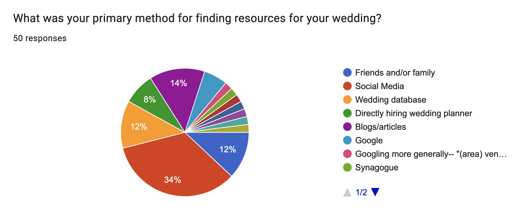
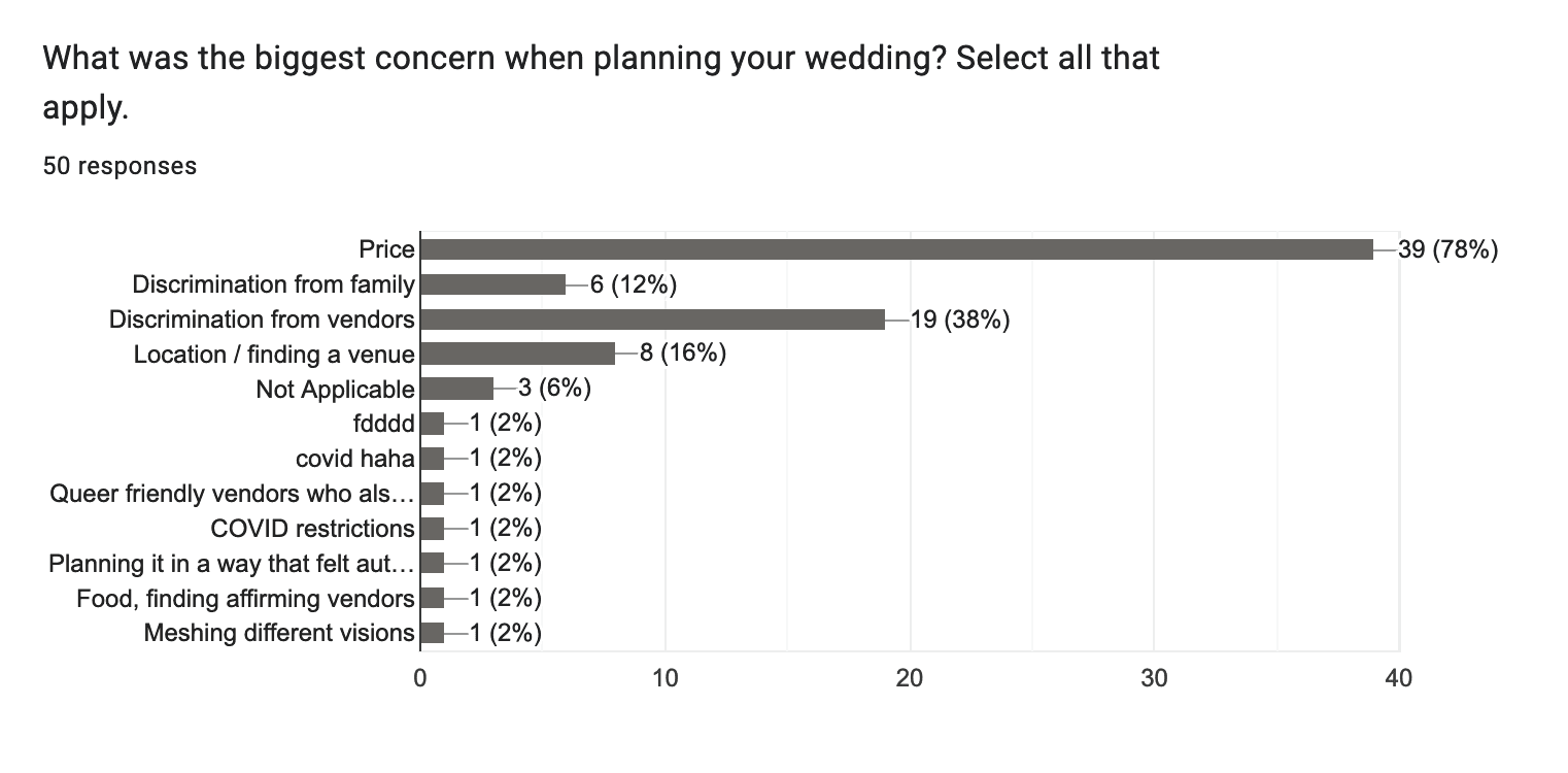
To gain a more elaborate view of the user experience, users were asked about what was important to them when planning their wedding, and touched on subjects like safety, budget, and where they felt their experience was lacking.
To gain a more elaborate view of the user experience, users were asked about what was important to them when planning their wedding, and touched on subjects like safety, budget, and where they felt their experience was lacking.
To gain a more elaborate view of the user experience, users were asked about what was important to them when planning their wedding, and touched on subjects like safety, budget, and where they felt their experience was lacking.
Utilizing queer wedding online support forums
Online Survey
Aiming for a wide net of user experiences, over 85 survey responses were collected from a variety of married or engaged queer people. A majority of the users responding were between the ages of 25-35, and noted that using social media to plan a wedding was a part of their journey, and that budget and discrimination from vendors were a major pain point.

Wedding planning is already stressful, so how do queer people navigate it?
User Interviews
Interviews were conducted with five participants via video call to learn about concerns or barriers users have come across in their planning journey, and to examine the behavior and thought process when they used existing digital services.
01
Within the age range of 25-35
01
Within the age range of 25-35
01
Within the age range of 25-35
02
Located within the US
02
Located within the US
02
Located within the US
03
Identify as queer either in sexuality or gender
03
Identify as queer either in sexuality or gender
03
Identify as queer either in sexuality or gender
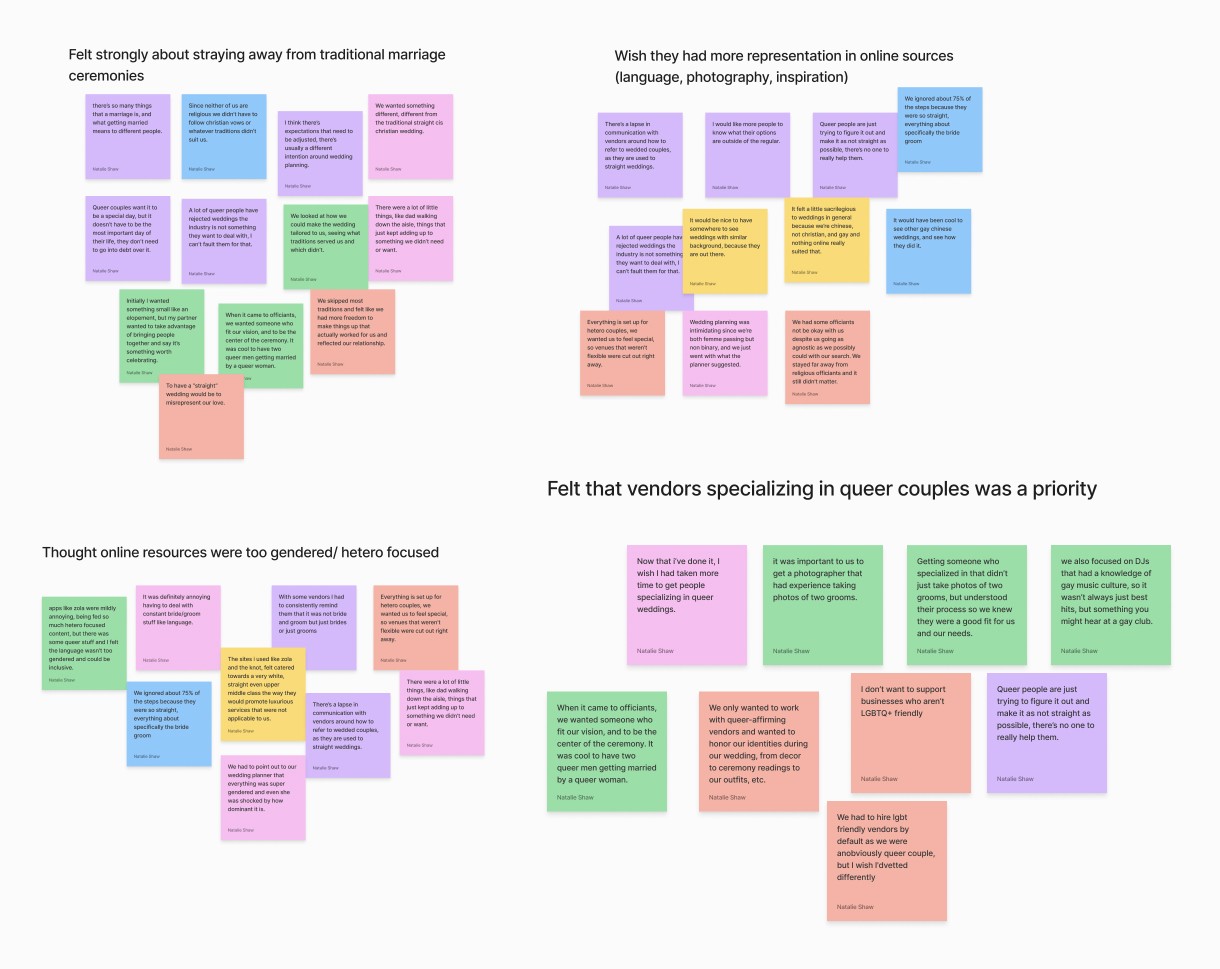


"I would have loved to see how other queer people did their wedding. It's like, so much of it really was just like another man, another woman doing another wedding.”
-Participant, when asked about their satisfaction using online wedding planning services
"I would have loved to see how other queer people did their wedding. It's like, so much of it really was just like another man, another woman doing another wedding.”
-Participant, when asked about their satisfaction using online wedding planning services
"I would have loved to see how other queer people did their wedding. It's like, so much of it really was just like another man, another woman doing another wedding.”
-Participant, when asked about their satisfaction using online wedding planning services
Evaluating the current online resources for queer users
Competitive Analysis
Looking at the most popular online wedding planning platforms it can be found that a majority of these sites featured little diversity in queerness, body type, culture, and race. Some sites had the option to look for LGBT owned businesses, but depending on the area, there would be slim to none. LGBTQ+ wedding databases did exist, but none with accessible UI or dedicated visuals.

LGBTweddings.com is a database that caters to queer couples, but lacks administrative upkeep and visual balance across the site.
LGBTweddings.com is a database that caters to queer couples, but lacks administrative upkeep and visual balance across the site.
LGBTweddings.com is a database that caters to queer couples, but lacks administrative upkeep and visual balance across the site.

The Knot has trendy branding and comprehensive planning tools, but lacks representation for marginalized couples and accessibility considerations.
The Knot has trendy branding and comprehensive planning tools, but lacks representation for marginalized couples and accessibility considerations.
The Knot has trendy branding and comprehensive planning tools, but lacks representation for marginalized couples and accessibility considerations.
Zola is a comprehensive tool and features the most queer couples, but users felt unnecessary services were pushed which made the experience less personable.
Zola is a comprehensive tool and features the most queer couples, but users felt unnecessary services were pushed which made the experience less personable.
Zola is a comprehensive tool and features the most queer couples, but users felt unnecessary services were pushed which made the experience less personable.
Some users were noted to like the simplicity of a service, but still felt that content didn't satisfy the image of their union. This expressed the need to take into account the vastness of the queer experience, as this is something queer/trans people felt was a need unmet in most wedding planning services.
Some users were noted to like the simplicity of a service, but still felt that content didn't satisfy the image of their union. This expressed the need to take into account the vastness of the queer experience, as this is something queer/trans people felt was a need unmet in most wedding planning services.
Some users were noted to like the simplicity of a service, but still felt that content didn't satisfy the image of their union. This expressed the need to take into account the vastness of the queer experience, as this is something queer/trans people felt was a need unmet in most wedding planning services.
Insights
Defining the Problem
With these in-depth discussions and surveys, these key insights were revealed, and I determined the problem I had to solve for.
Insights
Defining the Problem
With these in-depth discussions and surveys, these key insights were revealed, and I determined the problem I had to solve for.
Insights
Defining the Problem
With these in-depth discussions and surveys, these key insights were revealed, and I determined the problem I had to solve for.
Feeling Othered
Queer users felt discouragement by the lack of visual diversity on platforms that cater primarily to straight, skinny, and religious demographics.
Feeling Othered
Queer users felt discouragement by the lack of visual diversity on platforms that cater primarily to straight, skinny, and religious demographics.
Feeling Othered
Queer users felt discouragement by the lack of visual diversity on platforms that cater primarily to straight, skinny, and religious demographics.
Prioritized Convenience
Users felt that traditional wedding customs weren’t indicative of their union, but ultimately resigned creatively due to lack of resources online.
Prioritized Convenience
Users felt that traditional wedding customs weren’t indicative of their union, but ultimately resigned creatively due to lack of resources online.
Prioritized Convenience
Users felt that traditional wedding customs weren’t indicative of their union, but ultimately resigned creatively due to lack of resources online.
One Size Does Not Fit All
Users appreciated online services guidance in initial planning, but also felt pressured by sponsored services that they could not afford, or did not want.
One Size Does Not Fit All
Users appreciated online services guidance in initial planning, but also felt pressured by sponsored services that they could not afford, or did not want.
One Size Does Not Fit All
Users appreciated online services guidance in initial planning, but also felt pressured by sponsored services that they could not afford, or did not want.
“We wanted a meaningful celebration that reflected us, which meant considering what aspects of a wedding were important to us as a couple and what parts were just tradition for tradition's sake.”
-Participant
“We wanted a meaningful celebration that reflected us, which meant considering what aspects of a wedding were important to us as a couple and what parts were just tradition for tradition's sake.”
-Participant
“We wanted a meaningful celebration that reflected us, which meant considering what aspects of a wedding were important to us as a couple and what parts were just tradition for tradition's sake.”
-Participant
Turning insights into a plan
Considering all the research and competitive analysis thus far, it was determined that a product that can empower dissatisfied users would implement features like:
Turning insights into a plan
Considering all the research and competitive analysis thus far, it was determined that a product that can empower dissatisfied users would implement features like:
Turning insights into a plan
Considering all the research and competitive analysis thus far, it was determined that a product that can empower dissatisfied users would implement features like:
01
Smart Feed
Users can easily explore queer weddings, vendors, and categories that are relevant to them.
01
Smart Feed
Users can easily explore queer weddings, vendors, and categories that are relevant to them.
01
Smart Feed
Users can easily explore queer weddings, vendors, and categories that are relevant to them.
02
Vision Boards
A way to collect, share, and organize posts and vendors for wedding planning.
02
Vision Boards
A way to collect, share, and organize posts and vendors for wedding planning.
02
Vision Boards
A way to collect, share, and organize posts and vendors for wedding planning.
03
Contact a Vendor
Providing an efficient way to talk to and hire queer friendly vendors and businesses.
03
Contact a Vendor
Providing an efficient way to talk to and hire queer friendly vendors and businesses.
03
Contact a Vendor
Providing an efficient way to talk to and hire queer friendly vendors and businesses.
Through research it was revealed that, ultimately, queer couples want a wedding that encapsulates their union, and a way to see themselves in the platforms they use. To show what’s possible in the world of queer weddings and to inspire other queer people to envision the perfect day, I go on to develop an online service with visuals based feed curation, and a queer focused wedding vendor database.
Through research it was revealed that, ultimately, queer couples want a wedding that encapsulates their union, and a way to see themselves in the platforms they use. To show what’s possible in the world of queer weddings and to inspire other queer people to envision the perfect day, I go on to develop an online service with visuals based feed curation, and a queer focused wedding vendor database.
Through research it was revealed that, ultimately, queer couples want a wedding that encapsulates their union, and a way to see themselves in the platforms they use. To show what’s possible in the world of queer weddings and to inspire other queer people to envision the perfect day, I go on to develop an online service with visuals based feed curation, and a queer focused wedding vendor database.
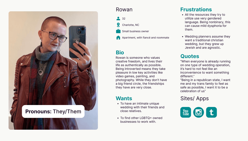
Persona Development
Based on patterns from user insights I developed three personas of different genders and sexuality, with common wedding planning needs.
Persona Development
Based on patterns from user insights I developed three personas of different genders and sexuality, with common wedding planning needs.
Persona Development
Based on patterns from user insights I developed three personas of different genders and sexuality, with common wedding planning needs.


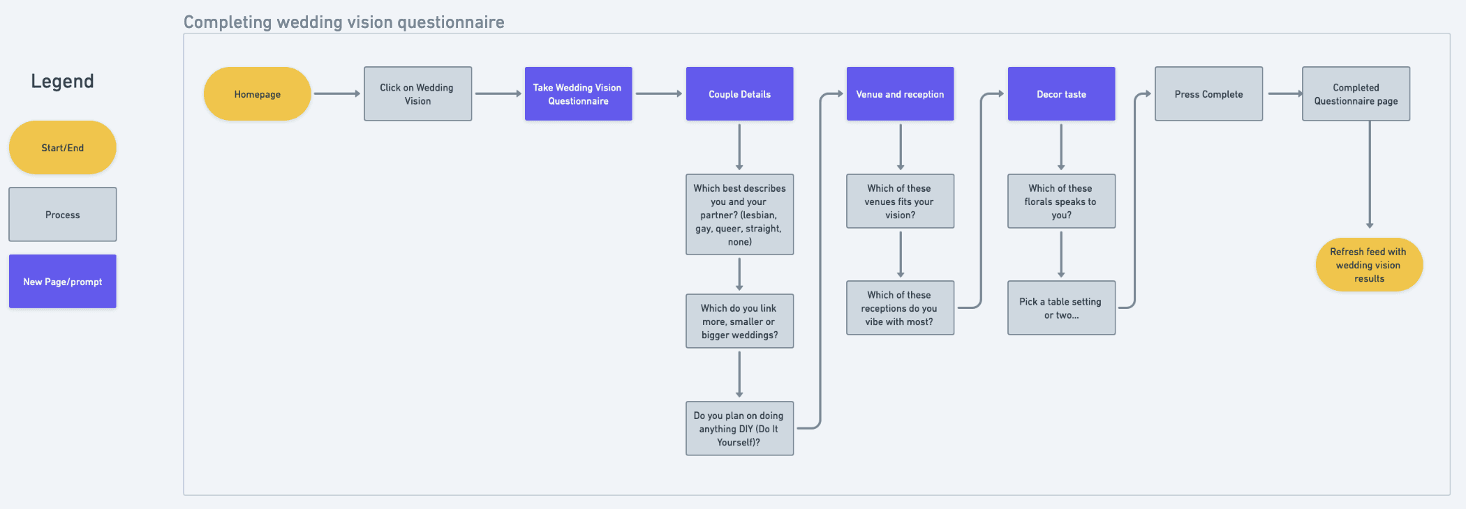
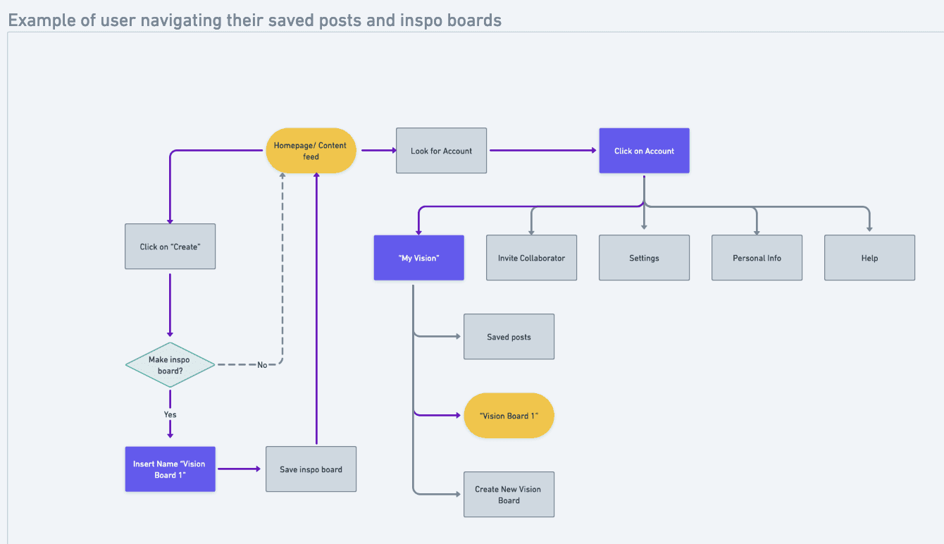
User Flows & Task Flows
A key consideration was designing the flow of the Vision Board, as I aimed to offer users a clear way to manage wedding logistics while creating their Vision Board. This approach was to allow them to integrate both elements, making the planning process more organized.
User Flows & Task Flows
A key consideration was designing the flow of the Vision Board, as I aimed to offer users a clear way to manage wedding logistics while creating their Vision Board. This approach was to allow them to integrate both elements, making the planning process more organized.
User Flows & Task Flows
A key consideration was designing the flow of the Vision Board, as I aimed to offer users a clear way to manage wedding logistics while creating their Vision Board. This approach was to allow them to integrate both elements, making the planning process more organized.


Design
Bringing Queer Joy to the Visual Experience
With our users primarily within the age 25-35 age range, I explored design patterns from existing visual based social media sites such as Pinterest or Instagram. The visual feed is the introduction into the inspiration space of the site, designed to immediately engage and excite to explore the possibilities.

Visual Design
Efforts were focused on creating a visually friendly and inviting interface that complemented the brand values of Inspiration, Compassion, Diversity, Joy, and Empowerment. To ensure accessibility, creating consistent menus, and a legible typeface gave the foundation for a easily navigable platform.
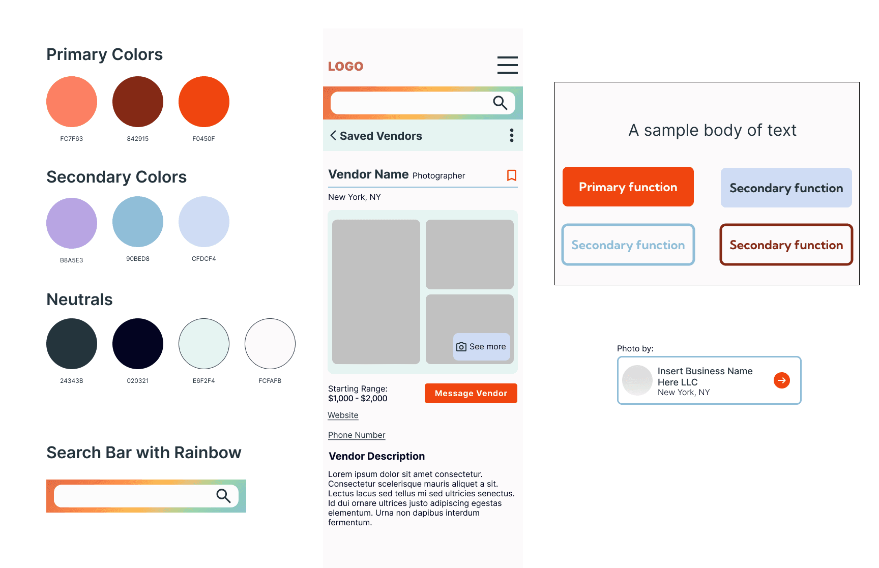

As there are few LGBTQ+ specific online wedding services, there's a challenge in creating a usable and appealing color palette that speaks to a queer audience. (A challenge I was happy to meet!) Research showed that existing wedding planning sites were not suitable for a gender and sexually diverse audience with a spectrum of opinions on marriage. In response to this, it was important to deviate from the traditionally feminine and very mature visual treatment that other sites used.
As there are few LGBTQ+ specific online wedding services, there's a challenge in creating a usable and appealing color palette that speaks to a queer audience. (A challenge I was happy to meet!) Research showed that existing wedding planning sites were not suitable for a gender and sexually diverse audience with a spectrum of opinions on marriage. In response to this, it was important to deviate from the traditionally feminine and very mature visual treatment that other sites used.
As there are few LGBTQ+ specific online wedding services, there's a challenge in creating a usable and appealing color palette that speaks to a queer audience. (A challenge I was happy to meet!) Research showed that existing wedding planning sites were not suitable for a gender and sexually diverse audience with a spectrum of opinions on marriage. In response to this, it was important to deviate from the traditionally feminine and very mature visual treatment that other sites used.
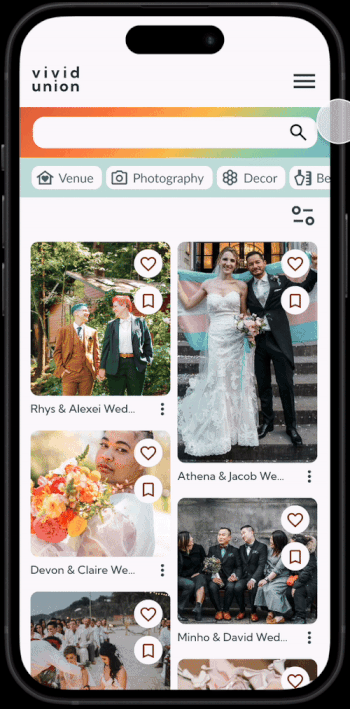
UI Exploration
Approaching the creation of a UI library, the different needs of the user were considered, from usability to visual appeal. A gallery grid is the basis for the user to discover content, further discovery is encouraged by an always visible quick search function, and different wedding categories to easily filter content options.

In wedding planning, queer users may encounter challenges when it comes to vetting vendors or finding product options relevant to their experience. For this, the interface was designed to remove barriers a user might encounter in order for them to have a smoother and more enjoyable planning experience.
In wedding planning, queer users may encounter challenges when it comes to vetting vendors or finding product options relevant to their experience. For this, the interface was designed to remove barriers a user might encounter in order for them to have a smoother and more enjoyable planning experience.
In wedding planning, queer users may encounter challenges when it comes to vetting vendors or finding product options relevant to their experience. For this, the interface was designed to remove barriers a user might encounter in order for them to have a smoother and more enjoyable planning experience.
Usability Testing
Weighing Ease of Use and User Satisfaction
Testing goals were set to improve usability in the wedding planning process, focusing on intuitive design, efficient task completion, and visual element support. Five participants were tested via video, with extra feedback from other designers.
01
From the homepage, create a new "Decorations" Vision Board.
01
From the homepage, create a new "Decorations" Vision Board.
01
From the homepage, create a new "Decorations" Vision Board.
02
Using the Venue category, find a post to contact the tagged venue.
02
Using the Venue category, find a post to contact the tagged venue.
02
Using the Venue category, find a post to contact the tagged venue.
03
Locate where would one go to see their saved vendors.
03
Locate where would one go to see their saved vendors.
03
Locate where would one go to see their saved vendors.

Insight
4/5 users struggled with going into the menu for making a Vision Board, all opted for going from a post on the feed to save.
Insight
4/5 users struggled with going into the menu for making a Vision Board, all opted for going from a post on the feed to save.
Insight
4/5 users struggled with going into the menu for making a Vision Board, all opted for going from a post on the feed to save.

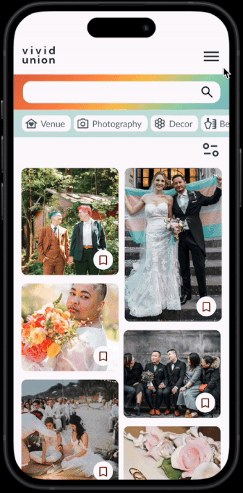
Revision
To address the gap in intuition, I implemented a function that allows users to both save to and create Vision Boards directly from the feed.
Revision
To address the gap in intuition, I implemented a function that allows users to both save to and create Vision Boards directly from the feed.
Revision
To address the gap in intuition, I implemented a function that allows users to both save to and create Vision Boards directly from the feed.
Insight
3/5 users instinct was to go outside "My Vision Boards" to see saved vendors, they felt it was a different concept outside of Vision Boards.
Insight
3/5 users instinct was to go outside "My Vision Boards" to see saved vendors, they felt it was a different concept outside of Vision Boards.
Insight
3/5 users instinct was to go outside "My Vision Boards" to see saved vendors, they felt it was a different concept outside of Vision Boards.
Revision
Change button to "My Wedding" and absorb Vision Boards as a category to consolidate all saved content and wedding information.
Revision
Change button to "My Wedding" and absorb Vision Boards as a category to consolidate all saved content and wedding information.
Revision
Change button to "My Wedding" and absorb Vision Boards as a category to consolidate all saved content and wedding information.

Insight
4/5 users felt that there wasn’t enough relevant information for the average person interested in booking certain venues.
Insight
4/5 users felt that there wasn’t enough relevant information for the average person interested in booking certain venues.
Insight
4/5 users felt that there wasn’t enough relevant information for the average person interested in booking certain venues.
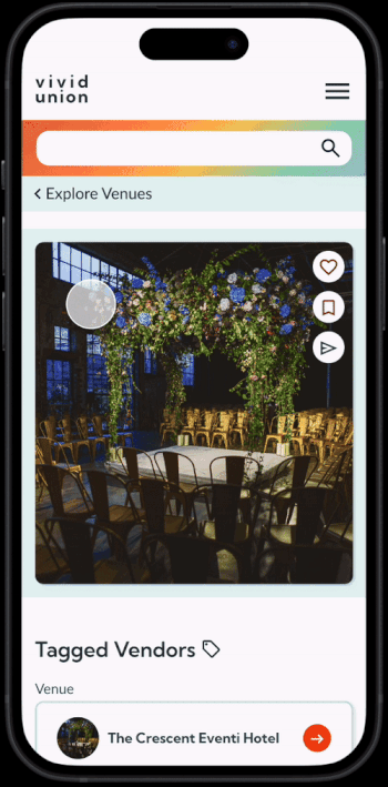
Revision
To enhance clarity, rate details and a key features section was implemented into the venue page.
Revision
To enhance clarity, rate details and a key features section was implemented into the venue page.
Revision
To enhance clarity, rate details and a key features section was implemented into the venue page.
Testing Summary
Before testing, it was thought that having the separation between wedding logistics and wedding inspiration would assist the user in finding what they need without confusion. To my surprise, users associated the two closely, and felt it was more convenient to have quick access to both. When it came to content, it was found that users want to engage with the content quickly, so providing an efficient way to create a new board and save to existing ones to continue exploration was a prioritized revision. Despite the initial confusion of My Wedding vs Vision Boards, remaining tasks were completed without additional assistance. Users found key information and navigated to relevant sections to complete the assigned tasks, showing me where the need for usability was met.
Final Designs
High Fidelity Screens
Final Designs
High Fidelity Screens
Final Designs
High Fidelity Screens


Reflection
Project Takeaways
When approaching this project, I wanted to explore the possible short falls of wedding planning as a queer person or couple, and solve for a way to make the experience more pleasant.
By leveraging diverse perspectives from participants, user testing, and design feedback, I analyzed social challenges and needs to translate solutions into a product that benefits both the user and business owner.
Speaking with users and hearing how they navigate wedding planning under pressure revealed the significant impact of security as an openly queer person. This experience solidified my belief in user-centric design as a solution to real-world challenges.